Enhancement of an intranet web application.
PROJECT OVERVIEW
The Product
Customer Service Central (CSC) - A CRM with customer & order details for internal users/analysts throughout Amazon's
supply-chain to manage different workflow processes.
The Problem
Some users get lost looking for info while some data is located deep in hierarchy thus hindering performance of users.
The Goal
Optimize site structure thereby increase user performance / task completion rate.
My Role
A UX designer re-structuring the web-app and redesign effected screens.
Responsibilities
Conducting user interviews, Create mid-high fidelity wireframes, Optimize sitemap, Co-facilitate usability tests, Iterate designs based on findings.
Tools
Adobe XD
Balsamiq
Mural
Whiteboarding
DESIGN APPROACH
User Research Summary
My User Research went through 5 different stages listed below. As a part of user interview process, spoke to internal users who fill daily tasks of various workflow processes such as 'order delivered but not received', 'Driver complaint appeals' etc.
-
Conduct Interviews – to clearly understand the design problem
-
Empathy Mapping - to pen down user's exact pain points and needs
-
Mind mapping – to jot down current taxonomies and enlist proposed version
-
Card sorting – to redefine the sitemap
-
Mockups- low fidelity mockups translating the design concepts
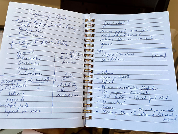
Notes from a User Interview

Conducted user research via contextual inquiry as well as by shadowing the internal agents who happen to be end users of the application. During the user research process, I have gathered information on the exact pinpoints of the users with the tool.
Card Sorting

Mapped out all the existing tabs (As-Is) and taxonomies on current application on one side while listed out the desired (to-be) taxonomies discovered while user research
Sitemap - Information Architechture

After making a list of refined taxonomies that should go under specific labels, the same has been tested out with users via card sorting design methodology
Mockups
Mid-Fidelity Wireframe showing new tabs and fields

Translated the findings from user testing via card sorting into low fidelity wireframes to share-out the design proposals with the leaders in the team. Created on Balsamiq.
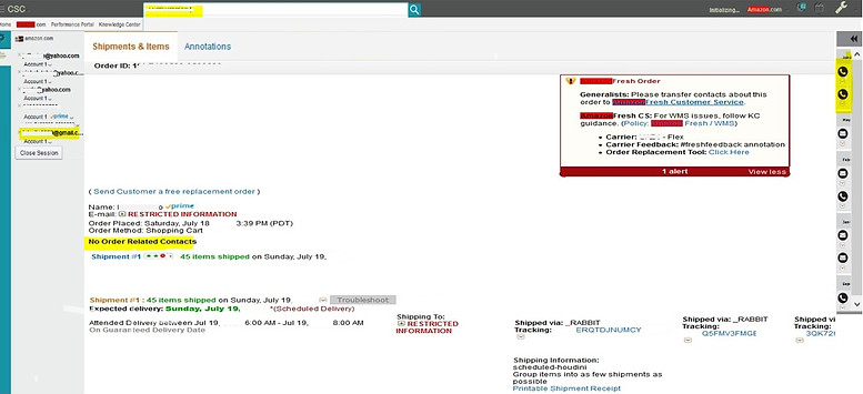
Existing screen - CSC homepage

Copy of application screen with the not-so-user friendly menu navigation. (Intentionally Blurred)
Screen with improved features

The low fidelity wireframes were incorporated into production and the revised sitemap has been published for CSC tool. (Intentionally Blurred)
DESIGN SUCCESS CRITERIA
Impact
With the revised sitemap that is more aligned to the user’s work flow has optimized the performance to 40% (Proven KPI metrics obtained after testing the live changes on a pilot team of 100 agents for a period of two months)
Learnings
- Interactions with end users gives us more enriched data that informs design decisions more than any secondary research.
- Accessibility is much more than color contrast, it is also about how easily information is organized & is readily available to access.